Matplotlib is a popular Python library used for data visualization. It provides a wide range of plotting functions that allow you to create various types of 2D and 3D plots. In this blog post, we’ll go over the basics of using Matplotlib for beginners, including code examples for the most common plots. If you have not installed the required libraries, you can follow the setup installation for Windows or Linux.
Creating 2D plots
2D plots are widely used, we use them in our own posts to convey information that would be difficult otherwise. To create a 2D plot, the most important thing is to have a Y value for every X value, then you can use a wide variety of plots to show the data.
Line graph
A line graph is a line in 2D space, this can be used as long as the data does not have any loops. This type of graph can be used for many things, such as time series visualization. In this example, we generate the X vector (100 values between -π and π) and we compute the cosine and the sine for each value.
import numpy as np
import matplotlib.pyplot as plt

# Generate data
x = np.linspace(-np.pi, np.pi, 100)
y_sin = np.sin(x)
y_cos = np.cos(x)

# Create plot
plt.plot(x, y_sin, label='sin')
plt.plot(x, y_cos, label='cos')
plt.xlabel('x')
plt.ylabel('y')
plt.title('Sine and Cosine Functions')
plt.legend()
plt.show()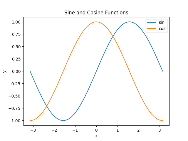
Scatter plot
A scatter plot represents data that has no linear correlation. For example, this kind of plot is a perfect fit for algorithms such as K-Means. In this example, we just generate 100 random values for X and 100 random values for Y.
import numpy as np
import matplotlib.pyplot as plt

# Generate some random data
x = np.random.randn(100)
y = np.random.randn(100)

# Create a scatterplot
plt.scatter(x, y)
plt.title('Scatterplot')
plt.xlabel('X-axis')
plt.ylabel('Y-axis')
plt.show()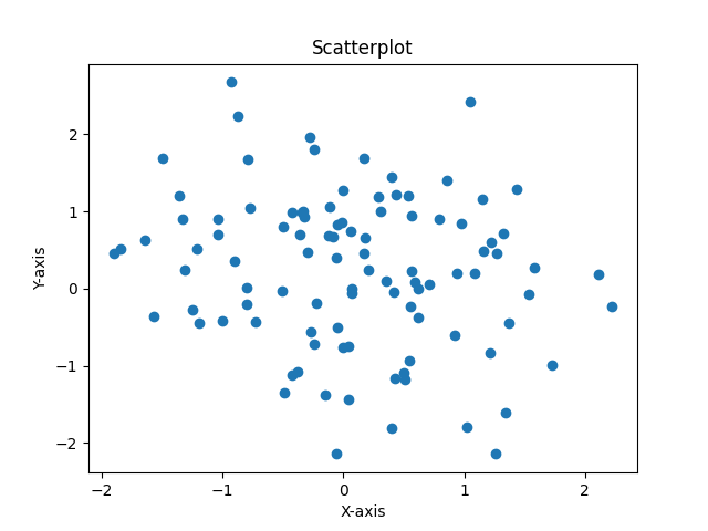
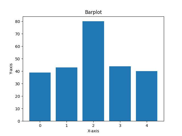
Bar plot
Bar plots are used to represent categorical data, where each bar represents a different category and its height is the proportional value of that category. Once again, we randomly generate the X values (just the indexes of the categories) and the Y values (the height) for this example.
import numpy as np
import matplotlib.pyplot as plt

# Generate some more random data
y = np.random.randint(100, size=(5))
x = [0, 1, 2, 3, 4]

# Create a barplot
plt.bar(x, y)
plt.title('Barplot')
plt.xlabel('X-axis')
plt.ylabel('Y-axis')
plt.show()
Creating 3D plots
3D plots are very useful in representing complex data. Although not so often used they can help much when the data does not fit the 2D space. In the case of the 3D plots, the usual way of working is generating the X and Y values, then generating a meshgrid (which generates a 3D object using those values) and then using Z for the height.
Surface plot
These plots represent a smooth surface in 3D, you could this kind of plot to do a 3D representation of the Gradient Descent method. In this example, we generate 100 values between -5 and 5 for X and Y, then we compute the Z value as the sum of sine and cosine at each point.
import numpy as np
import matplotlib.pyplot as plt
from mpl_toolkits.mplot3d import Axes3D

# Generate data
x = np.linspace(-5, 5, 100)
y = np.linspace(-5, 5, 100)
X, Y = np.meshgrid(x, y)
Z = np.sin(X) + np.cos(Y)

# Create plot
fig = plt.figure()
ax = fig.add_subplot(111, projection='3d')
ax.plot_surface(X, Y, Z)
ax.set_xlabel('x')
ax.set_ylabel('y')
ax.set_zlabel('z')
plt.title('3D Plot of z = sin(x) + cos(y)')
plt.show()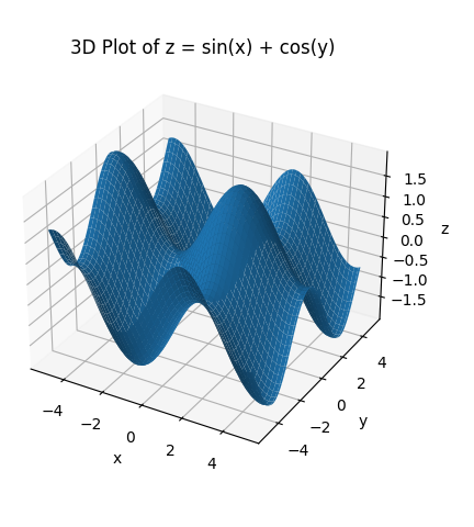
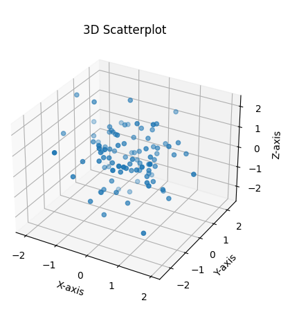
Scatter plot 3D
Just as with the 2D scatter plot, this kind of plot is used to represent data without any relationship. We have used this kind of plot in the past to show a K-Means algorithm with 3 dimensions. Since our individual points are independent, in this kind of plot we do not need to create a meshgrid. We simply create 100 values for X, Y and Z and plot them.
import numpy as np
import matplotlib.pyplot as plt
from mpl_toolkits.mplot3d import Axes3D

# Generate some random data
x = np.random.randn(100)
y = np.random.randn(100)
z = np.random.randn(100)

# Create a 3D scatterplot
fig = plt.figure()
ax = fig.add_subplot(111, projection='3d')
ax.scatter(x, y, z)
ax.set_title('3D Scatterplot')
ax.set_xlabel('X-axis')
ax.set_ylabel('Y-axis')
ax.set_zlabel('Z-axis')
plt.show()
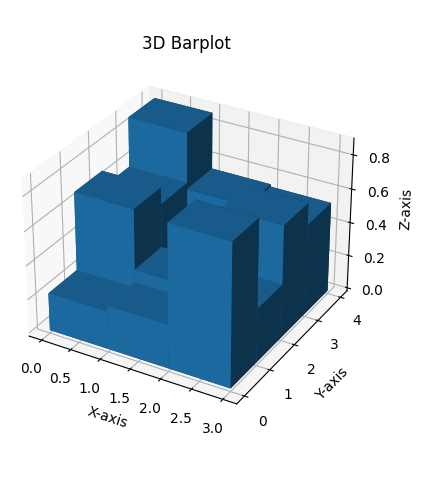
Bar plot 3D
Although less used than its 2D counterpart, we include it here for completion. This can be used to represent categories that have relationships between them. In this case, the most confusing part is line 16, where we use the x-coordinates given by the flattened “xx” array, y-coordinates given by the flattened “yy” array, z-coordinates set to 0, a width of 1, a depth of 1, and heights given by the flattened “zz” array.
import numpy as np
import matplotlib.pyplot as plt
from mpl_toolkits.mplot3d import Axes3D

# Generate some random data
x = np.arange(3)
y = np.arange(4)
xx, yy = np.meshgrid(x, y)
zz = np.random.rand(4, 3)

# Create a 3D barplot
fig = plt.figure()

ax = fig.add_subplot(111, projection='3d')

ax.bar3d(xx.ravel(), yy.ravel(), np.zeros(len(zz.ravel())), 1, 1, zz.ravel())

ax.set_title('3D Barplot')
ax.set_xlabel('X-axis')
ax.set_ylabel('Y-axis')
ax.set_zlabel('Z-axis')
plt.show()
Conclusion
In conclusion, matplotlib and numpy are powerful tools for creating both 2D and 3D plots in Python. With matplotlib’s extensive library of plot types and customization options, is easy to create visualizations that effectively communicate the data. Numpy’s numerical capabilities allow for efficient data manipulation and computation, enabling the use of large datasets. Whether it’s creating simple line plots or complex 3D visualizations, these libraries provide a comprehensive set of tools for data visualization in Python.


0 Comments