Setup
In a previous post, we talked about the K-Means algorithm. In order to better understand how this algorithm works we will implement it from scratch in Python. To install the necessary tools please make sure to follow our setup posts either for Windows or for Linux.
To improve the readability of this post we will only show the essential parts of the code, to get the full code please download it from our repository.
The first thing we need to do is to open a Jupyter notebook (or the existing one from the repository). To do that open a terminal, and activate your virtual environment. I recommend you to go to the folder that contains the code you just downloaded and run:
jupyter notebookThis will execute Jupyter and output a URL on the same terminal, copy and paste that URL on your desired browser (the URL typically looks like this: http://localhost:8888/?token=26e0ed28a7df8511c8789376d422dd36bc015a1403efd7cb).
If done correctly you should see something like this:
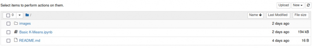
Please click on the “Basic K-Means.ipynb” file.
The data
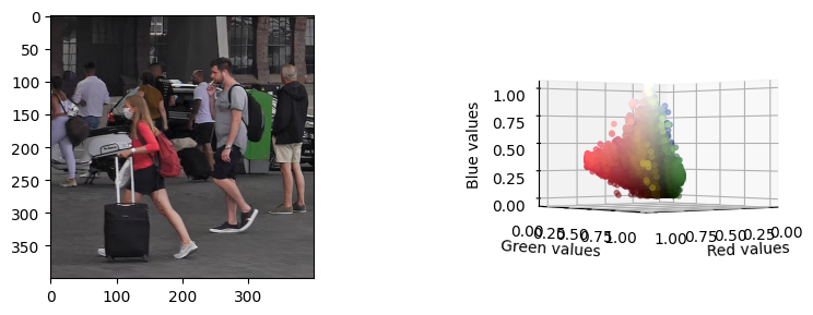
We have prepared a test image that has CC0 license (we can use it freely). If you choose any other image please make sure it is not very big, since K-Means will take much longer with bigger images. As you can see above, the visualizations provided in the code show the picture next to a 3D scatterplot. This scatterplot shows the pixels of the image as 3D points using the RGB channels as XYZ coordinates. Each point is colored with the original color of the picture. This allows us to get a cloud of points and see how the K-Means algorithm will group similar color sections together.
K-Means algorithm
def k_means(centroids, dataset, max_iterations=10):

    # Structure to keep track of which point is in which cluster
    clusters = [[] for x in range(len(centroids))]
    indexes = [[] for x in range(len(centroids))]

    previous_centroids = None

    # Main loop
    for i in range(max_iterations):

        # Assign each point to its nearest centroid
        for point_index, point in enumerate(dataset):

            dist = float('inf')
            candidate_centroid = 0 # Index of the candidate cluster

            for centroid_index, centroid in enumerate(centroids):

                # Get the distance between the point and the centroid
                d = np.linalg.norm(point-centroid)

                # If we are closer to this centroid
                # assign this point to this centroid
                if d < dist:
                    dist = d
                    candidate_centroid = centroid_index

            # Now we know that index_point belongs to index_cluster
            clusters[candidate_centroid].append(point)
            indexes[candidate_centroid].append(point_index)

        # Now we recalculate the centroids, by doing the mean per cluster
        centroids = ([np.mean(np.array(clusters[x]), axis=0)
                      for x in range(len(centroids))])

        # If the centroids have not changed, we have reached the limit
        # We need to use this generator since we are dealing with an
        # array of numpy arrays
        if (previous_centroids != None
            and not all([np.array_equal(x, y)
                         for x, y in zip(previous_centroids, centroids)])):
            print("Breaking")
            break

        # Update the previous centroids
        previous_centroids = centroids

    return (centroids, indexes)
We show the basic implementation above, this algorithm receives 3 parameters and returns 2:
Input parameters
- centroids: The initial centroids of our dataset. You can just choose K points from your original dataset
- dataset: An array with all the points of the dataset
- max_iterations: This is an optional parameter to limit the maximum number of iterations K-Means will take. K-Means will stop if it reaches the limit of iterations or if the centroids have not moved
Output parameters
- centroids: A list of K elements with the values of the centroids
- indexes: A list that tells us to which cluster belongs each data point. For example, if indexes is [0, 0, 1], the first 2 points of our dataset would belong to cluster 0 and the third would belong to cluster 1.
Visualizing different K values
Visualizing the results of Machine Learning algorithms can be very tricky. We have created a visualization that will hopefully allow you to understand how the clusters have formed in more detail. We have reused the RGB scatterplot explained above, but we now paint each point as the color of its centroid. The centroid of each cluster is the mean of all its points, so this gives us the average color. By using the slider below you will be able to switch between different values of K. We encourage you to explore the graph and identify the different clusters. Some interesting questions you may ask yourself:
- When does the green color finally get its own cluster? Why so late?
- Why does red have such an important presence?
- From K=10 to K=20 the visual changes are not very big, why?

In case you want to think about those questions first, we have hidden the answers, feel free to check them when you are ready!
- When does the green color finally get its own cluster? Why so late?: Green has very little presence on the image and its points are very close to big clusters
- Why does red have such an important presence?: If you explore the graph, you will see that the values of red are very separated from the others, this means that the red on the picture is very strong and “captures” other clusters
- From K=10 to K=20 the visual changes are not very big, why?: Most of the clusters are created close to the dark colors since there is a big density of points there, visually dark colors do not pop up that much


0 Comments